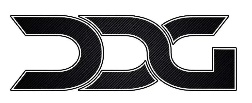
The competent examining bodies carry out this assessment from the perspective of the average consumer of the relevant category of goods and consider whether such consumers are likely to confuse the marks at issue. Where marks consist of apparent letters, particular importance attaches to whether, and if so which, letters those consumers are able to recognise.
This is illustrated vividly by a recent decision of the General Court of the European Union (GC) (judgment of 7 May 2025, T-53/24). A well-known German games manufacturer had filed an opposition against the registration of the trade mark reproduced below for, inter alia, games and toys:

(EUTM No. 018567763, available at https://euipo.europa.eu/eSearch/#details/trademarks/018567763)
The opposition was based on a word/device mark for toys which is clearly formed from the letters “D-O-G”, with the cut-out in the letter “O” representing a stylised paw. The mark is used for a rather successful board game. The games manufacturer alleged a likelihood of confusion between its earlier mark and the mark applied for, arguing that the latter could likewise be perceived as a stylised mark consisting of the letters “D-O-G” and thus as the English word for “dog”. In particular, it submitted that the central element, in its closed form, could also be recognised as an “O”.
After the games manufacturer had already failed with this line of argument before the first two instances, the case recently came before the General Court. The European judges, however, showed the manufacturer little sympathy and upheld the findings of the lower instances. The first two elements of the contested mark were formed identically, which suggested that the public would recognise identical signs or letters. Of particular importance was the left-hand part of the characters, with its slanted ends. The majority of the relevant consumers would perceive the letter combination “D-D-G”, while a smaller proportion might see a purely graphic design preceding the letter “G”. By contrast, the letter “O” could not be perceived. On that basis, the General Court concluded that, in light of this understanding of the mark, a likelihood of confusion had to be ruled out.
The decision is, in its outcome, comprehensible. It might, however, have been decided differently had the central element of the contested mark been designed only slightly more rounded, or had some other visual association with a dog been incorporated, such as a stylised paw. The decision illustrates how fine the line can be in trade mark law between likelihood of confusion and distinctiveness. From the perspective of effective trade mark enforcement, it may therefore be appropriate even in such borderline cases to take action against identified trade mark applications.

